Example Data Visuals in The Maroon
This document shows examples of data visualizations in Chicago Maroon articles. If you would like to use one of these graphs as a starting point for another graph, follow the corresponding link to the graph's source code in our GitHub repository. Note that some of these plots are from older Maroon articles, so they may not adhere to newer style standards.
Bar Charts
A simple horizontal bar chart with horizontal axis units in
thousands of dollars.
Column Charts
A column chart with three series over four groups along with
a caption clarifying an edge case.
A stacked column chart with numerical labels above each bar
and a clarifying caption.
A stacked column chart with many columns.
Line Charts
A simple line chart.
A line chart with irregular time intervals.
A line chart with multiple series that start at different
times.
A complex line chart with several series.
A line chart with series labels.
Pie Charts
A pie chart.
Word Clouds
A word cloud.
Maps (HighCharts)
A HighCharts map of the US with multiple colors of pins.
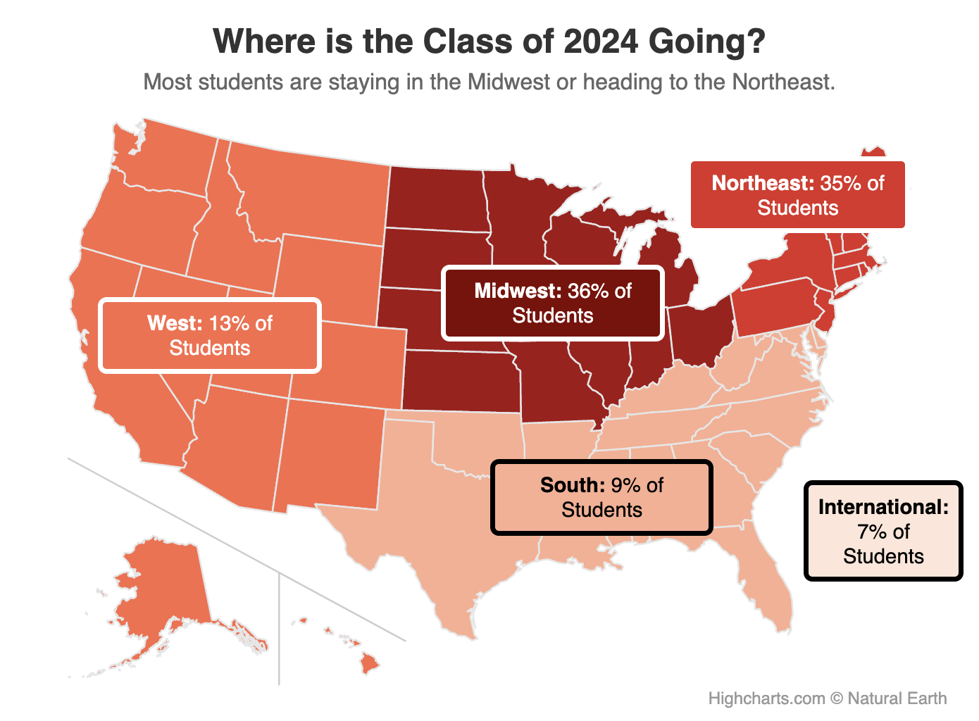
A HighCharts map with labels over regions added via HTML.
(Note: this graph is not interactive because the HTML boxes
are independent of HighCharts, so they do not scale as the
window's size changes.)
Maps (Google Maps)
A Google Maps map with two pins.
A Google Maps map with many pins.
Maps (Leaflet)
A Leaflet map with graduated symbols of different shapes and
colors.
Other
A custom HTML visual showing political donation amounts
visually.